Zobnatica Equestrian Club
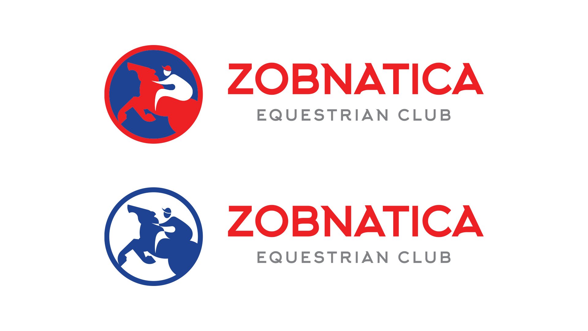
Zobnatica Equestrian Club sought a rebranding that would respect its established identity while evolving its visual elements. The brief was to update the logo and typeface, ensuring they were effective in both English and Serbian.
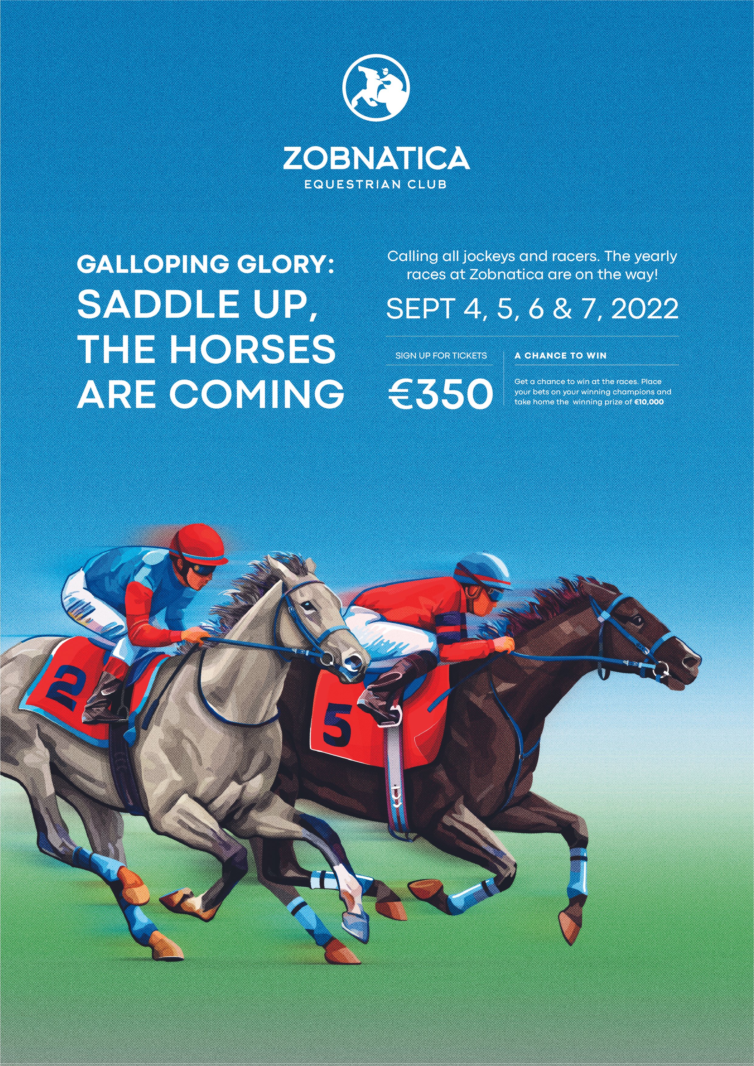
The revised logo combines imagery of a horse and equestrian elements, enhanced with a vibrant color palette of red and blue. This evolution maintains the club’s heritage while refreshing its brand identity.
REBRANDING DESIGN


